
How to Build a Website That Stops the Guessing
Before You Even Think About Design…
Most business owners open Squarespace and jump straight into choosing colors, layouts, and fonts. It feels exciting at first, but very quickly the guessing starts. Sections get moved around, pages feel disconnected, and the whole process becomes more confusing than it needs to be.
The truth is that a great website doesn’t start with design. It starts with clarity. When you know exactly what your pages need and how your content should flow, every design decision becomes easier. Your website feels more intentional, more professional, and much easier for your customers to navigate.
That clarity begins with one simple step.
Start With a Wireframe Before You Design Your Website
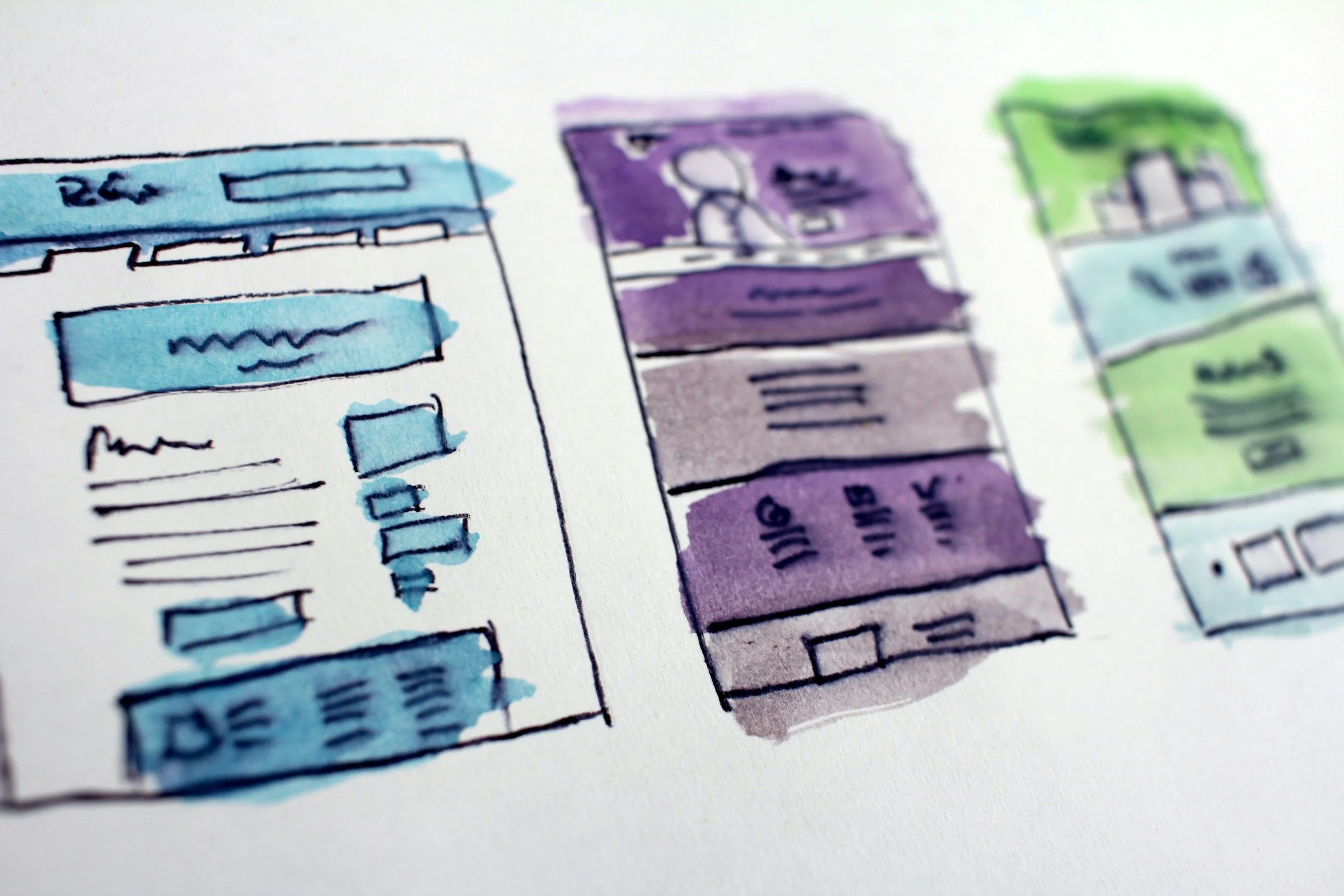
Before you jump into colors, fonts, and layouts, you need a simple wireframe. A wireframe is the basic outline of your website that shows what pages you need and what goes on each one. It’s your roadmap. When you start with a wireframe, you’re not guessing or designing blindly. You’re building from a clear plan that keeps your content organized and your customer journey intentional.
A solid wireframe helps you create a website that feels professional, easy to navigate, and effortless to manage as your business grows. It’s the foundation that makes every design decision faster, cleaner, and more strategic.

Photo Credit: Diva Plavalaguna
Why a Wireframe Helps You Build a Website With Clarity

PHOTO CREDIT: picjumbo.com
What a Wireframe Actually Is
A wireframe is the simple outline of your website. It shows what pages you need and what goes on each page before you touch any design. No colors, no fonts, no visuals. Just structure. Think of it as the blueprint that guides every decision you make during your build.
Why Your Website Needs One
When you start with a wireframe, you remove all the guesswork. You’re not dragging sections around or trying to figure out where things should go. You already have a clear plan. This makes your website feel intentional, organized, and easy for your customers to navigate.
How It Creates a Better User Experience
A wireframe helps you map out the flow of your content so visitors instantly understand your business. They know where to find your services, how to learn about you, and where to take action. That clarity keeps people on your site longer and makes it easier for them to trust your brand.
Why It Makes Your Build Easier
When your pages follow a clear outline, designing becomes simple. You’re not overwhelmed by choices because the structure is already set. You make faster decisions, avoid clutter, and keep your layout consistent across every page.
A wireframe is the foundation of a user‑friendly, professional website. It keeps your message focused, your design clean, and your entire site easier to manage as your business grows.

Write Out Your Core Pages
Grab a pencil, pen, or what ever you have and start with a short list of the pages your site needs. Most small business websites begin with four essentials.
Home
About
Services
Contact
If you need more pages, add them, but keep your list simple. A clean structure helps visitors understand your business quickly.
Sketch What Each Page Looks Like
When you’re planning your website, don’t jump straight into design. Start by sketching out what each page needs. Literally just list the sections in the order you want someone to experience them. This isn’t about making it pretty yet. It’s about creating a clear flow.
Think of it like mapping out a story. Your Home page should guide someone from “Who are you?” to “What do you offer?” to “Why should I trust you?” and finally “What should I do next?”
A simple outline might look like this:
Hero section
Intro
Services preview
Testimonials
Call to action
You’re not designing yet. You’re simply deciding the order of your content so your website feels natural from top to bottom. This step alone removes so much confusion because you’re giving yourself a structure to follow instead of guessing as you go.
Visualize the Scroll Experience
Now imagine someone landing on your site and actually scrolling through that page. Picture it like you’re watching over their shoulder. What do they see first? What do they understand next? Where do they naturally want to go?
Ask yourself:
Does the order make sense
Does each section support the main message
Is anything missing
This is where your website starts to feel intuitive. When the scroll experience flows, your visitor doesn’t have to work to understand your business. They’re guided through your content in a way that feels effortless.
If something feels out of place, too long, or confusing, you’ll catch it here — before you ever start designing. And that saves you hours of reworking later.
Build the Structure in Squarespace
Once your wireframe is mapped out, this is where you bring it to life inside Squarespace. Think of this step as building the skeleton of your website. You’re not designing yet. You’re simply placing the sections in the right order so you can see the full structure before you start refining anything.
Start With a Blank Page
Open Squarespace and create a fresh page so you’re working from a clean slate.
Go to: Pages → Add Page → Blank Page
This gives you an empty canvas to build on, which makes it easier to follow the flow you planned in your wireframe.
Add Sections Based on Your Outline
Now you’ll start dropping in the sections you sketched earlier.
Go to: Edit → Add Section → Page Layouts
Choose layouts that match the sections in your wireframe. If your Home page outline was:
Hero
Intro
Services
Testimonials
Call to action
Then add those sections in that exact order. You’re simply stacking the building blocks so your page flows the way you planned.
You’re Not Designing Yet
This part is important. You’re not choosing colors, adjusting fonts, or styling anything. You’re just placing the bones of your website. When you see the full structure laid out, it becomes so much easier to design with intention later.
This step gives you clarity. It helps you confirm your flow, spot anything missing, and make sure your website feels natural from top to bottom before you start polishing.
Bringing It All Together
When you follow this process step by step, building your website stops feeling overwhelming and starts feeling intentional. Your wireframe gives you clarity. Sketching each page helps you understand the flow. Visualizing the scroll lets you see your website through your customer’s eyes. And building the structure in Squarespace gives you a clean foundation before you ever touch design.
This is how you create a website that feels organized, professional, and easy to navigate. You’re not guessing. You’re not dragging random sections around. You’re building with purpose.
By the time you start styling, your entire site already has direction. Every section has a job. Every page has a clear message. And your customer’s experience feels smooth from top to bottom.
This is the difference between a website that looks “fine” and a website that actually works for your business.

Photo Credit: MART PRODUCTION
A Final Secret Tip
Before you start styling, step back and look at your structure with fresh eyes. Pretend you’re a brand‑new visitor who knows nothing about your business. Scroll through your pages and ask yourself:
“If I landed here for the first time, would I instantly understand what this business does and what I should do next?”
If the answer is yes, your structure is solid. If not, adjust your sections now — before you start designing. This one habit saves you hours and makes your final website feel intentional and clear.
Thank You for Reading This Far
I really appreciate you staying with me through this entire guide. It tells me you care about building a website that truly supports your business and gives your customers a clear, confident experience. You are doing the right things in the right order, and that intention is going to show in every part of your final site.
And since you made it all the way to the end, I want to invite you to reach out to me personally. I would love to learn about your business, your goals, and the kind of website you want to build. Every business has its own story, and when I understand yours, I can help you create a site that feels aligned, strategic, and ready for growth.
As a thank you for reading this far, I would be happy to give you a free website audit. Whether you already have a site or you are starting fresh, I will take a look and share simple, actionable insights you can use right away.
Whenever you are ready, reach out. I would love to see what you are building and help you take your next step with confidence.
Catch up on All My Blogging Related Blog Posts Here.
You’ll Also Love



Hello, world! I’m Lourin. I’m a Kansas City mama, creative, and website designer who loves helping small businesses and community leaders show up with clarity and confidence. Here on the blog you can read about my favorite things, like small business growth, simple website tips, community stories, and the behind‑the‑scenes of building a life and business I love. So glad you’re here!



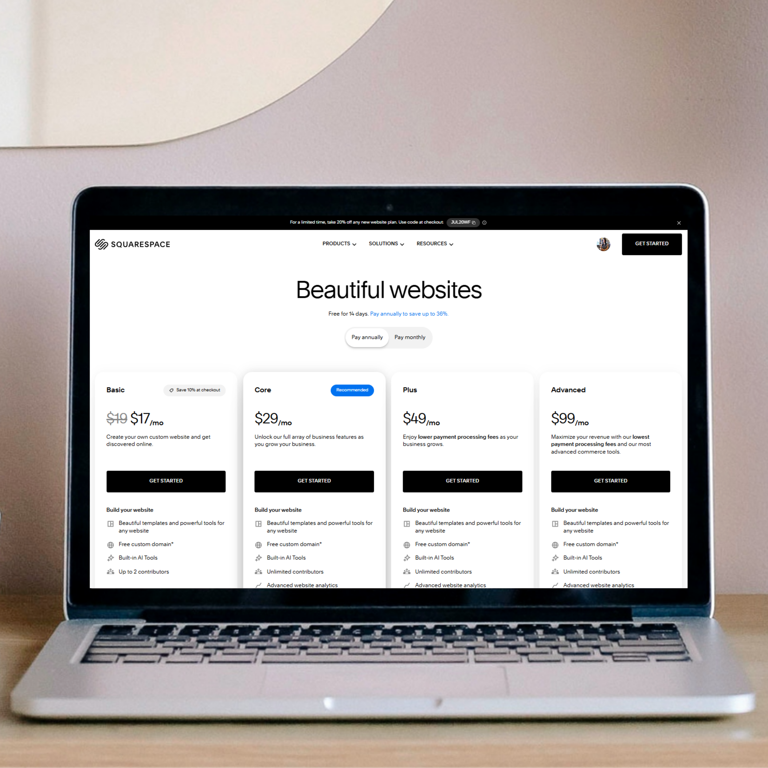
Business owners often look for the best website platform because they want something reliable, simple to manage, and strong enough to support real growth. Squarespace and Showit both promise creative freedom, but the experience of running your business on each platform feels very different. Squarespace gives you an all‑in‑one system that handles hosting, SEO, security, blogging, ecommerce, and mobile design without extra tools. Showit offers flexibility, but it also brings more steps, more plugins, and more long‑term maintenance. This guide breaks down the real differences so you can choose the platform that protects your time, supports your brand, and keeps your website running smoothly as your business expands.