The Squarespace Homepage Formula I Use to Boost Conversions
Your homepage is not just a pretty landing spot. It is your digital storefront, your handshake, your elevator pitch, and your first impression all rolled into one. Most small business owners treat it like a cute welcome mat. I treat it like a money making machine.
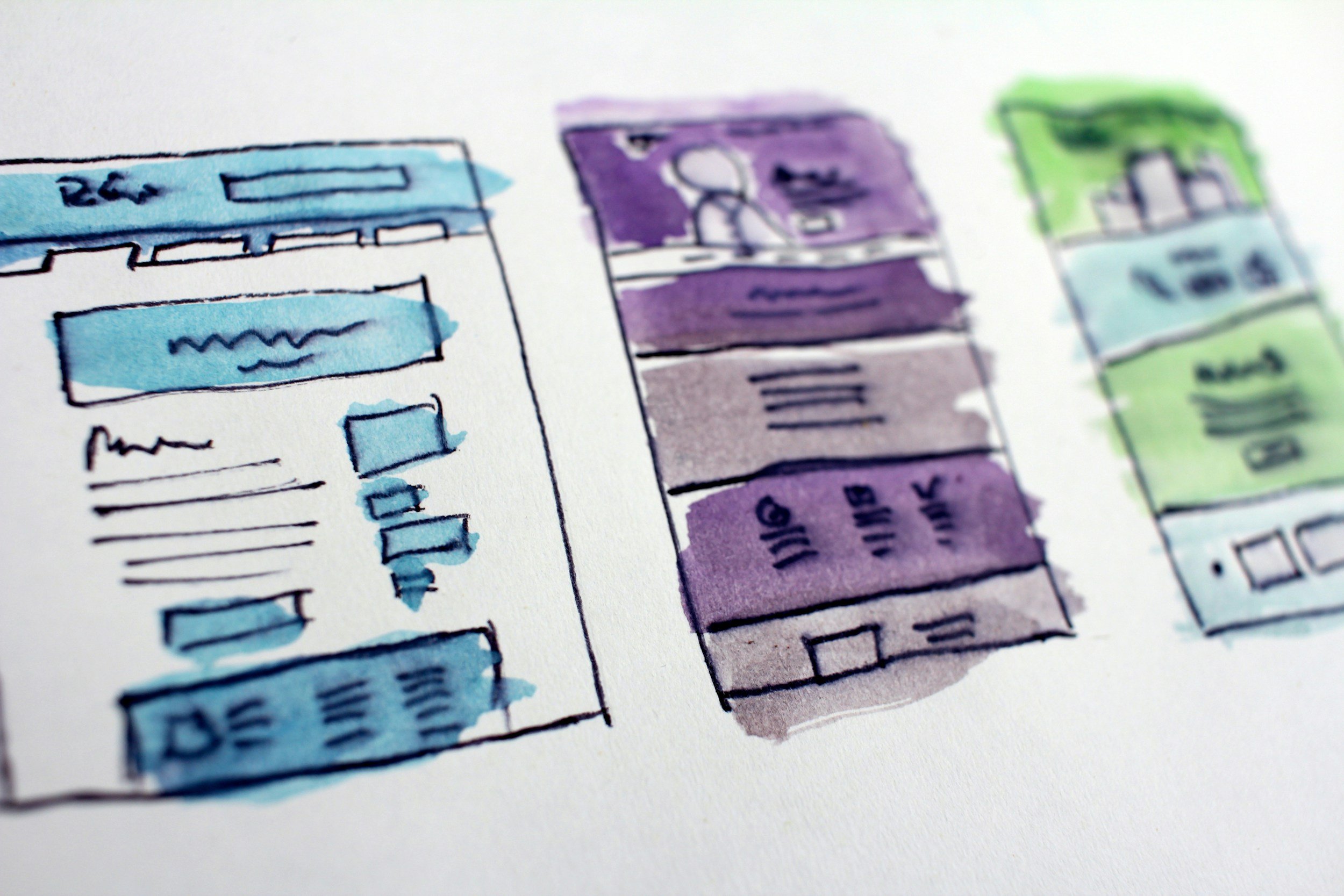
A strong Squarespace homepage layout guides visitors through a clear path so they know exactly who you are, what you offer, and what to do next. When you design with intention, your website conversions go up without adding more content, more pages, or more chaos.
This is the exact formula I use for every small business client who wants a homepage that works harder than they do.
1. A Clear, Simple Hero Section
Your hero is your first impression. It needs to hit fast and hit clean. Think of it like Tori Dunlap walking into a room with a perfect one liner or Codie Sanchez dropping a spicy truth bomb.
Your hero should answer three things in under five seconds.
Who you help
What you do
The outcome you create
Keep the headline short. Keep the subheading simple. Add one strong call to action. Remove anything that feels like fluff. Clarity converts.
2. A Quick Snapshot of What You Offer
People do not want to dig around your site like it is a treasure hunt. They want the TLDR. Give them a clean overview of your main services right under the hero.
Use short descriptions. Use clean icons or images. Think of this section like a menu at a restaurant. If people cannot skim it fast, they bounce.
This is one of the strongest UX for small business moves you can make.
3. A Why It Works Section
This is where you flex a little. Not in a braggy way. In a confident, I know what I am doing way.
Use three short points that highlight your process, your values, or the results you deliver.
Examples:
A simple three step process
A unique method you use
A belief that sets you apart
This section builds trust and helps visitors understand why your approach works better than the next person’s.
4. A Featured Service or Offer
If you have a signature service, this is where you spotlight it. Think of it like your Beyoncé track. The one everyone comes for.
Add a benefit focused headline. Add a short description. Add a button that leads to the full service page. This guides visitors toward the action you want them to take.
This is how you turn casual scrollers into actual leads.
5. Social Proof That Builds Trust
People trust people. Not websites. Not logos. Not fancy fonts.
Add two or three strong testimonials that show real results or positive experiences. If you have client logos, add them. If you have before and afters, add them. If you have a review that makes you blush, definitely add it.
Social proof is one of the fastest ways to increase website conversions.
6. A Simple About Preview
This is not your full life story. This is your highlight reel.
Share who you are, what you care about, and why you do what you do. Keep it short. Keep it warm. Keep it human. Then link to your full About page for the people who want the deeper version.
This section helps visitors feel connected to you before they ever meet you.
7. A Clean Call To Action Section
End your homepage with a clear next step.
Examples:
Book a call
Fill out a form
View your services
Shop your products
Keep the design simple. Keep the message direct. Make the button obvious. This is the moment where visitors decide if they are in or out.
Why This Formula Works
This layout follows natural user behavior. It gives visitors the information they need in the order they need it. It reduces confusion. It builds trust. It guides people toward taking action. It is simple, strategic, and designed for real humans.
When your homepage is structured with intention, your Squarespace homepage layout becomes a conversion tool instead of a digital brochure.

About the Author
Lourin DosSantos Website Designer, Brand Strategist, and Community Leader
Lourin DosSantos is a creative strategist who helps small businesses, beauty professionals, and community organizations show up with clarity and confidence. She focuses on clean design, simple systems, and warm communication to create websites and brands that feel personal and easy to use. Lourin supports clients through website design, brand identity, digital management, and ongoing content support.
She also serves on the Board of Advisors for POAC Succeed and leads Women Who Read Leadership, a Kansas City community for women who want to grow and connect. Her work reflects her commitment to belonging, empowerment, and practical tools that strengthen both individuals and communities.