
Make Your Squarespace Site Look Clean, Modern, and Professional
How to Make Your Squarespace Site Actually Look Right
If you want to make your Squarespace site look right, focus on simple styling choices that create consistency. Clean spacing, strong images, and a clear color palette help your site feel polished, modern, and easy for visitors to navigate.

Photo Credit: Noemí Jiménez
Why Consistency Helps Your Squarespace Site Look Right
Consistent styling builds trust. When your spacing, fonts, and images match across every page, your site feels organized and professional. Visitors can focus on your message instead of distractions.
Set Your Global Styles First
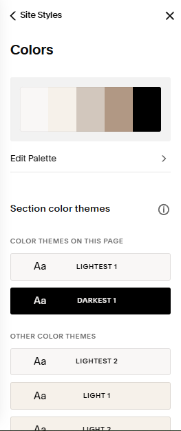
Open Design → Site Styles and adjust your global settings. Choose one font pairing, one spacing style, and one line height. These settings apply across your entire site and help everything look unified.
Simple global styles load faster and look better on mobile.
Choose a Clean Color Palette
Go to Design → Colors and select a palette with three to five colors. Use one main brand color, one accent color, and neutral tones for backgrounds. A small palette helps your site look modern and intentional.
Avoid using too many bright colors. They can make your layout feel busy.
Use High‑Quality Images
Replace stretched or blurry images by clicking the image block and selecting Replace → Upload. Aim for images that are at least 2000 pixels wide. Large, clear images help your Squarespace site look right on both desktop and mobile.
If your images look uneven, crop them to similar shapes for a cleaner layout.
Adjust Spacing for a Clean Layout
Open each section and adjust Section → Padding. Use consistent spacing at the top and bottom of every section. Then open each block and adjust Block → Inset to create balanced white space.
Good spacing makes your content easier to read and gives your site a modern feel.
Preview Your Site on Mobile
Click the mobile icon at the top of the editor. Check your spacing, stacking order, and image sizes. Most visitors browse on their phones, so your mobile layout needs to look right.
Fix any sections that feel crowded or uneven.
Catch up on All My Blogging Related Blog Posts Here.
You’ll Also Love



Hello, world! I’m Lourin. I’m a Kansas City mama, creative, and website designer who loves helping small businesses and community leaders show up with clarity and confidence. Here on the blog you can read about my favorite things, like small business growth, simple website tips, community stories, and the behind‑the‑scenes of building a life and business I love. So glad you’re here!




Business owners often look for the best website platform because they want something reliable, simple to manage, and strong enough to support real growth. Squarespace and Showit both promise creative freedom, but the experience of running your business on each platform feels very different. Squarespace gives you an all‑in‑one system that handles hosting, SEO, security, blogging, ecommerce, and mobile design without extra tools. Showit offers flexibility, but it also brings more steps, more plugins, and more long‑term maintenance. This guide breaks down the real differences so you can choose the platform that protects your time, supports your brand, and keeps your website running smoothly as your business expands.